What makes an architecture website win awards
Architecture websites win awards on a scored rubric: Awwwards weights design 40, usability 30, creativity 20 and content 10. Build for the rubric, not taste.
By Zaid Rais, web engineer, Amsterdam · 1326 words
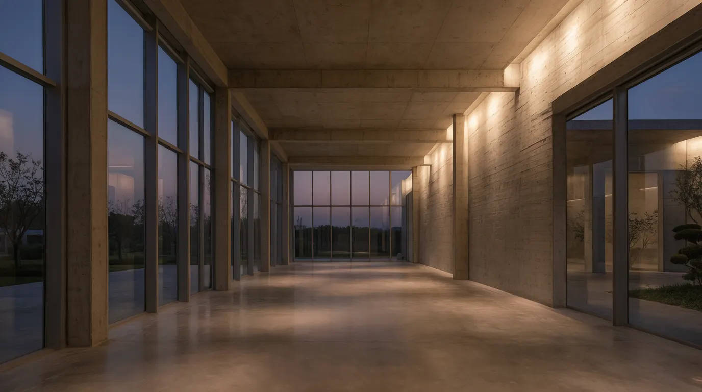
Awards are scored, not felt. Awwwards juries weight design at 40 percent, usability at 30, creativity at 20 and content at 10. An architecture site wins when the photography runs full width, the build stays fast on a phone, and the project pages hold real content. Build against the rubric.
How are architecture website awards actually judged?
By a numbered rubric that is published in advance, which is the part most practices never read.
Awwwards scores four categories with fixed weights: design at 40 percent, usability at 30, creativity at 20, content at 10. The evaluation criteria are open on their site. A jury member gives each category a mark out of ten and the weighted average is the score.
The Webby Awards use six criteria instead: content, structure and navigation, visual design, functionality, interactivity, and overall experience. Different labels, similar centre of gravity.
Read both lists and the same conclusion falls out. Roughly half the available marks sit on things an engineer controls, not an art director. Usability, structure, functionality and content are the difference between a site that looks like an award winner and one that scores like it.
That is the gap I see most often when a practice sends me a site they are proud of. The art direction is strong. The build underneath it is a theme with a 6 MB homepage.
Which awards are worth entering as an architecture practice?
The honest answer is that they matter for peer visibility and recruitment more than for enquiries.
Awwwards Site of the Day and Honourable Mention are the ones the design world watches. FWA is the same audience with a heavier bias toward technical ambition. The Webbys reach further outside the industry and carry weight with clients who are not designers. Dezeen and Architizer awards judge buildings, not websites, though a strong site is how the jury and the press first meet the building.
A badge in your footer does almost nothing for a property developer deciding whether to shortlist you. What does something is that a site built to survive a jury is also a site that loads in under two seconds, puts the work first and answers the questions a client arrives with. The rubric is a proxy for discipline, and discipline is what converts.
If you never enter a single award, the criteria are still the best free specification you will find for web design for architects.
Why do good-looking architecture sites lose?
They lose on the categories nobody rehearses.
The first image arrives too late
Google's threshold for Largest Contentful Paint is 2.5 seconds for 75 percent of visits, measured on real user hardware, not on your studio iMac. The Core Web Vitals documentation sets that number and Search uses it.
Architecture homepages break it more than any other category I audit, because the hero is a photograph shot at 6000 pixels wide and uploaded untouched. A single 4 MB JPEG on a phone over a mobile connection is a five second wait, and the jury member on a train has already scrolled past.
My rule of thumb, and I label it as one: a full-bleed header image should land under 180 KB as WebP or AVIF, with the art direction preserved through cropping rather than compression. On this site every journal header is compressed through sharp to that budget before it ships.
The animated hero on my own homepage is the harder version of the same problem. It plays 288 frames on a canvas element rather than as a video, because a video decoder fights the scroll on mid-range Android. Measured on my machine it runs at 117 fps, and the frames are pre-scaled so the total payload behaves like a single photograph rather than a film.
The work sits three clicks behind a menu
Usability is 30 percent of the Awwwards score. A hamburger menu on desktop, a landing page of typography with the first building below the fold, and a projects index that loads twelve identical grey thumbnails all cost marks.
Look at how the practices with real archives handle it. MVRDV publish hundreds of projects and put filtering by programme, location and status directly on the index, because with that volume search is the design problem. Olson Kundig go the other way and open on one building at full width. Both are defensible. Neither hides the work.
The content category is left empty
Content is only 10 percent at Awwwards, but it is most of the Webby rubric, and it is the category where architecture sites are weakest. Project pages that carry a title, a location and eight photographs with no captions have nothing for a jury to reward and nothing for a search engine to index.
What does an award-standard project page contain?
The same material you would present in a pitch, in the same order.
- The brief, in two or three sentences, including who the client was and what they were solving.
- The site and its constraints. Orientation, planning envelope, existing fabric, whatever actually shaped the decision.
- The answer, written as a decision rather than a description. What you did instead of the obvious thing.
- Drawings placed next to the photograph they explain. A section beside the interior shot of the double-height space earns more than a plan sheet dumped at the end.
- Numbers. Gross area, completion year, storeys, structural system, certification if you have one.
- Credits and press. Photographer, engineer, contractor, publications with links.
Six blocks. A consistent structure across twenty projects reads as rigour to a jury and gives you twenty pages that can rank for a building name and a city.
How much motion is safe?
Enough to explain space, and no more.
Creativity is 20 percent of the score, so a static site rarely takes Site of the Day. But motion is judged inside usability as well as inside creativity, and a scroll-jacked homepage that fights the trackpad loses more in the first category than it gains in the second.
The motion that survives a jury tends to do a job: a sectional reveal that moves through a building, a crossfade between the drawing and the built result, an image sequence that walks a facade. The motion that fails is a page transition that adds 400 milliseconds to every navigation.
Honour prefers-reduced-motion in the media query. Juries check.
What should I fix first?
In this order, because this is the order the marks come in.
- Measure the homepage on a real phone with PageSpeed Insights. If LCP is above 2.5 seconds, nothing else you do matters yet.
- Compress and re-crop the hero. Serve modern formats. Set explicit width and height so the layout does not shift.
- Move one finished building above the fold at full width and put the practice statement after the proof.
- Rewrite three project pages against the six-block structure. Three done properly beat twenty stubs.
- Then, and only then, design the motion.
This sequence is not specific to architecture. I used the same order on the builder side, where the goal is a phone call rather than a badge, and wrote it up in how a home builder website books site visits. The trade changes, the arithmetic does not.
Does any of this bring in work?
Indirectly, and that is the point worth being straight about.
A jury and a developer want different things from your site, but they both want to find the relevant building fast, see it presented at the size it deserves, and understand what you decided and why. The award rubric happens to be a written specification for that.
So I build architecture sites to the rubric even when the practice has no intention of entering anything. It is the cheapest available quality gate, it is public, and unlike taste it can be checked line by line before launch.
Questions people ask
- How is an Awwwards score calculated?
- Jury members mark four categories out of ten with fixed weights: design 40 percent, usability 30, creativity 20, content 10. The weighted average produces the final score. Site of the Day generally requires a score in the high sevens or above.
- How fast should an architecture homepage load?
- Largest Contentful Paint under 2.5 seconds on a real phone, which is Google's Core Web Vitals threshold for 75 percent of visits. That usually means a hero image under a few hundred kilobytes in WebP or AVIF.
- How many projects should the homepage show?
- One finished building at full width, then three more. Depth belongs on the projects index. The homepage is a claim about what you can do, not a complete archive.
- Does an award badge win architecture clients?
- Rarely on its own. Badges carry weight with peers, press and recruits. Clients respond to the fast load, the clear navigation and the project pages that a jury-standard build forces you to produce.
- Is scroll-jacking penalised by juries?
- Usually yes. Motion is judged under usability as well as creativity, so animation that fights the trackpad or delays navigation loses more marks than it earns. Motion that explains a building performs better.
Zaid Rais designs and builds websites, SEO and generative engine optimization, and AI assistants for architects, interior designers, home builders and real estate. Read more on web design for architects, or book a consultation.