How to photograph and order a project for the web
Interior designers should present each project as a fixed sequence: one wide establishing shot, the before or plan, three to six rooms, two details.
By Zaid Rais, web engineer, Amsterdam · 1513 words
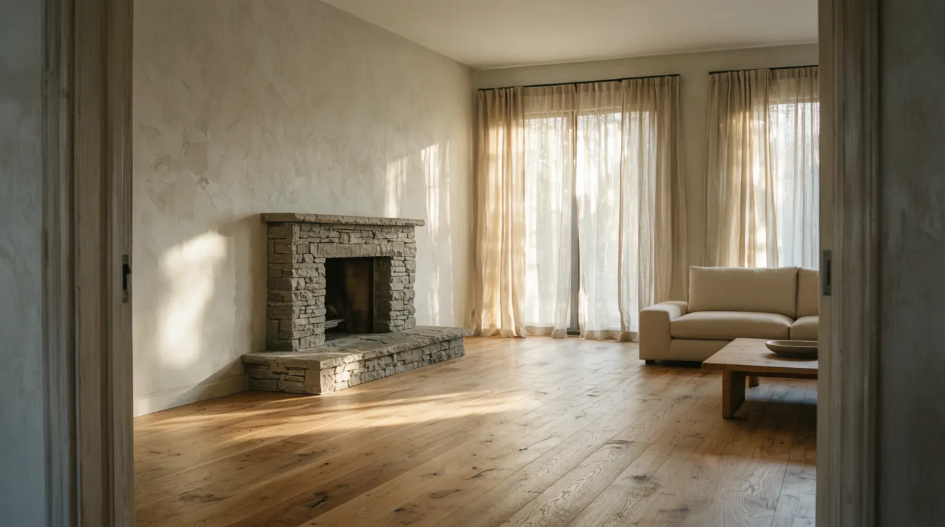
Show one project at a time, in a fixed sequence: one wide shot of the finished room, then the before or the plan, then three to six rooms, then two close details. Eight to fourteen images per project, captioned in your own words, ordered the way you would walk a client through the house.
How many images does one project need?
Eight to fourteen. That is a rule of thumb rather than a rule, and it holds because the decision happens early. A homeowner or a hotel developer looks at the first two frames and either keeps scrolling or leaves. Publishing forty images does not buy forty chances to win the job; it sets your weakest frame beside your strongest and asks a stranger to do the editing you should have done.
The instinct after a shoot is to justify the shoot. Resist it. The photographer delivered sixty usable files because that is what a day of shooting produces, not because sixty belong on a page. Keep the rest for press requests, awards submissions and the pitch deck, where they are useful and where nobody is deciding whether to email you.
One test I apply when I am sequencing a portfolio: remove any image that repeats a decision already visible in an earlier frame. Two views of the same kitchen from a metre apart is one image and one duplicate.
What order should the images go in?
The same order for every project. A portfolio reads as one body of work when the projects share a structure, and reads as a folder of uploads when each one is arranged by mood. Four beats, in this order.
The establishing shot
One wide frame of the room that carries the project, taken from the doorway or the natural point of entry. Full width, no crop games, nothing above it but the project name. This is the image a visitor judges you on, so it is the one you shoot most carefully and the one you compress last.
The before, or the plan
Second, the state of the house as you found it, or the plan if the before photos do not exist. This is the frame that separates a designer from a stylist. It shows what was moved, what was structural, what was a decision rather than a purchase. A phone snap taken on the first site visit is fine here; nobody expects it to be lit.
The rooms, in walking order
Three to six frames, sequenced as a route through the house rather than by importance. Entrance, living, kitchen, stair, bedroom, bath. Walking order is how your clients describe the project to their friends, and it gives the page a logic the visitor can feel without naming.
Two closes
End on two details that carry the material story: a joinery edge, a stone junction, a handle, a curtain heading. Two is the number, because a run of six close crops turns a project page into a texture library and loses the rooms.
What should the captions say?
What the image cannot show. Fifteen to forty words, in your voice: the constraint you were given, the material and where it came from, the decision that was hard. A caption reading Living room, Amsterdam adds nothing that the photograph has not already said.
Captions are also the only place on a project page where prose belongs. The page does not need a paragraph of marketing above the images, and the images do not need a headline explaining that light matters. Write the brief, the house as found, the plan and the materials as short factual lines, then let the sequence do the rest.
Alt text is a separate job from the caption. Google's image guidance asks for a plain description of what is in the frame, and screen readers read it aloud, so write for someone who cannot see the photograph rather than for a search engine.
How large should the files be before they go on the site?
Long edge around 2,400 pixels, target weight under 300 KB each, served as WebP or AVIF with a JPEG fallback. Those numbers are working defaults, not physics, but the format choice is measurable: Google's WebP documentation reports lossy WebP files at 25 to 34 percent smaller than comparable JPEG at equivalent quality, and lossless WebP at 26 percent smaller than PNG.
The reason to care is the threshold, not the tidiness. Largest Contentful Paint should be 2.5 seconds or less at the 75th percentile of visits, and on an interior design site the largest contentful element is almost always your establishing shot. A 4 MB hero on a phone signal misses that threshold on its own, before a single font or script has loaded.
Three things I do on every project page. The first image loads eagerly and with priority, because it is the one being measured. Everything below the fold loads lazily. Every image carries explicit width and height attributes so nothing shifts as the page fills, which is what keeps layout shift near zero while a full-bleed page assembles itself.
If you want the full picture of how I weigh photography against speed and structure, I published the rubric I use to score design, content and speed.
Does this change what I brief the photographer?
Yes, and this is where most of the value sits. Build the shot list from the page template, not from the rooms. If the template needs one wide, one before, four rooms and two closes, then the brief asks for exactly that, plus one alternative of each.
Two requests worth adding. Ask for a vertical of every room you intend to publish at full width, framed at 4:5, because the crop most visitors see is a phone screen and a landscape frame cropped to portrait loses the ceiling and the floor at once. And ask for the wide of each room from the doorway, at standing eye height, even if a lower or angled composition is prettier; the doorway frame is the one a stranger can read in half a second.
On licensing, check what you actually bought. Photographers commonly licence web use for a term or a territory rather than in perpetuity for all media, and a project page that stays live for six years outlasts a one-year licence. Credit the photographer on the page either way.
What about before photos and images you did not commission?
Publish the before as it is. A dim phone photograph of a bad kitchen is more persuasive than a rendered simulation of one, and matching the viewpoint and crop of the after does more for the comparison than any slider widget. Never retouch a before to look worse than it was; the one thing worse than no before is a before nobody believes.
Press and testimonials go up as they appeared, with the publication and the date, not paraphrased into your own copy. The same discipline applies to project facts. Naming the year, the city and the scope makes a page findable and checkable, which is the same reason it works for a boutique agency in listing pages versus brand pages.
Where does Instagram fit?
As a source of frames, not as a structure. Square and carousel thinking pushes designers towards images that read at thumbnail size, and a website is the opposite problem: one image, very large, holding attention for a few seconds. An embedded feed also imports third-party scripts into a page you have just spent a week making fast.
A useful public reference point is Vincent Van Duysen Architects, which as it stands presents work project by project, labelled with name, place and year, and lets the photography hold the page with almost no prose around it. Nothing about that structure depends on the studio's size. It is a decision about sequence and labelling, and it is available to a two-person studio with one finished apartment.
A neighbouring discipline confirms it. When I looked at what makes an architecture website win awards, the pattern was the same: fewer projects, harder sequences, no copy between the visitor and the work.
What should I fix first?
- Cut every project down to eight to fourteen images and put the strongest wide first.
- Add the before or the plan as image two, even where it is a phone photograph.
- Rewrite captions to say what the frame cannot show, in fifteen to forty words.
- Re-export everything at 2,400 pixels on the long edge in WebP, then measure your establishing shot against the 2.5 second threshold on a phone.
- Build the next shoot brief from the page template, and ask for a 4:5 vertical of every room.
That is the whole method, and it is mostly editing rather than spending. When I build web design for interior designers, this sequence is the template the site is made around, so a new project drops into a structure that already works instead of being arranged from scratch each time.
Questions people ask
- How many photographs should one interior project have on a website?
- Eight to fourteen as a working default: one wide establishing shot, one before or plan, three to six rooms in walking order, and two material details. Keep the rest for press and awards submissions.
- What size should interior photographs be for a website?
- Around 2,400 pixels on the long edge, under roughly 300 KB each, served as WebP or AVIF. Google reports lossy WebP at 25 to 34 percent smaller than comparable JPEG at equivalent quality.
- Should I show before photos even if they are poor quality?
- Yes. A phone photograph of the house as you found it proves the decisions you made. Match the viewpoint and crop of the finished frame, credit nothing to retouching, and never make a before look worse than it was.
- How fast does an image-heavy project page need to be?
- Largest Contentful Paint should be 2.5 seconds or less at the 75th percentile of visits, per Google. On a project page that element is your establishing shot, so it loads with priority and everything below it loads lazily.
- Can I just embed my Instagram feed instead?
- Not as the structure. Square crops are built for thumbnails, and an embedded feed loads third-party scripts into a page you optimised. Use Instagram as a source of frames and publish the sequence natively.
Zaid Rais designs and builds websites, SEO and generative engine optimization, and AI assistants for architects, interior designers, home builders and real estate. Read more on web design for interior designers, or book a consultation.