Why bold service-led builder sites beat pretty ones
A home builder site wins work by being legible before it is attractive: trade, area, price bracket and phone visible first, with proof and speed behind them.
By Zaid Rais, web engineer, Amsterdam · 1558 words
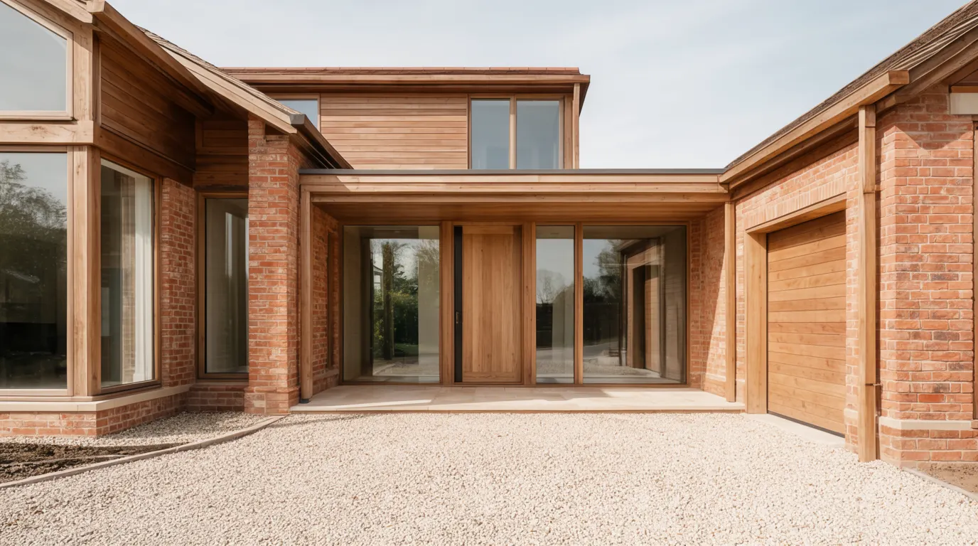
A builder site wins work by being legible before it is attractive. Homeowners comparing five companies in one evening need the trade, the area, the price bracket and a way to call, all visible without scrolling. Bold, service-led layouts state those facts. Pretty layouts hide them behind atmosphere.
What does trade-fit design actually mean for a builder?
Trade-fit design means the site is shaped by how the trade is bought, not by what looks good in a design gallery.
An architecture studio sells judgment, so its site can lead with authorship and let the reader work a little. A home builder sells delivery certainty: can you build this, in my street, to this standard, without the job running away from me. Those are different purchases, and they need different page furniture.
So the design job for a builder is subtraction of ambiguity. What you build. Where you build. What it costs, at least as a bracket. What happens after the first phone call. Everything decorative sits behind those four answers, not in front of them.
I wrote about the mechanics of the enquiry path in what a home builder website needs to book site visits. This piece is about the layer above it: the visual and editorial posture that makes those mechanics work.
Why does a pretty builder site underperform?
Because taste-led design tends to remove exactly the information a homeowner is shopping for.
I see the same pattern often enough to name it. A full-bleed hero of a kitchen at dusk. Thin grey type over the photo. A line of copy about creating spaces where families come together. No phone number in the header. A gallery of twelve photos with no captions, no location, no scope, no year. Somewhere on page three, a contact form with a message box and nothing else.
Nothing on that site is badly made. It simply does not answer whether the company does loft conversions in Haarlem or builds forty-unit schemes in Rotterdam. The homeowner cannot place you, so they leave and place the next builder instead.
Pretty also invites a second failure: the photography becomes the whole product. A gallery without scope, budget bracket and timeline is a mood board, and a mood board does not book a site visit. The same problem shows up in a different trade in my note on photography for interior design sites.
What should the homepage do in the first five seconds?
It should place you geographically and commercially before it tries to impress anyone.
My rule of thumb, and I am labelling it as a rule of thumb rather than a measurement: on a 375 pixel wide phone, a visitor should be able to read one finished-work image, one sentence naming the trade, the areas served, and reach a tap-to-call button without scrolling more than one screen.
That usually means four elements above the fold and nothing else:
- One finished house or room, full width, shot in daylight.
- A single sentence in plain trade language. Custom home builder and renovation contractor for Amsterdam and North Holland beats we create exceptional living environments.
- The areas you serve, written out as words, because that is also how people search.
- Phone and booking, in the header, sticky on mobile.
Underneath, the order that works is finished work, then services, then areas, then proof, then who you are. The about section earns its place last. Homeowners read it, but only after they have decided you are plausible.
What does bold look like without looking cheap?
Bold is contrast and confidence in the type, not colour volume and decoration.
The difference is worth being specific about, because service-led sites go wrong in a predictable direction.
What works:
- Large, high-contrast headings. Dark text on light, or light on a genuinely dark surface. No grey-on-photo captions.
- Photographs at full width with room to breathe, one per idea, captioned with location and scope.
- One accent colour, used for actions only, so a button always reads as a button.
- Generous tap targets and form fields. Builders get read on phones, often outdoors.
- Numbers where you have them. Years trading, projects completed, guarantee length, typical build window.
What reads as cheap:
- Stock imagery of hard hats and blueprints. A homeowner can tell within a second, and it implies you have no photos of your own work.
- Badge soup: fifteen association logos in a row at 60 pixels tall, none of them explained.
- Autoplaying video with sound, carousels that move on their own, and counters that animate on scroll.
- Drop shadows and gradients on every card, which is the visual equivalent of shouting.
Bold and service-led are compatible with restrained taste. The mistake is thinking the alternative to decoration is timidity. A builder site should look like a company that turns up on time with the right van.
How do service and area pages carry their weight?
By being written for one job in one place, in the words a homeowner would use.
One region done properly beats ten done thinly
A builder with genuine coverage of one city and its surrounding towns should have a small number of real area pages, each with projects actually built there, the travel radius stated, and local specifics like conservation area consents or typical plot constraints.
Twenty near-identical pages with the town name swapped is the pattern search engines have spent years discounting, and it also reads badly to the one person who matters. If you have not built in a town, do not claim it as a service area with a dedicated page. Name it in a list of places you travel to and leave it there.
Name the work the way homeowners name it
Homeowners do not search for residential construction solutions. They search for kitchen extension, loft conversion, dormer, side return, barn conversion, full house renovation. Each of those deserves its own page with scope, a realistic price bracket, a typical timeline, and two or three completed examples.
Price brackets are the single most common omission I find on builder sites, and the most costly. A bracket filters the enquiries you do not want and reassures the ones you do. It does not commit you to anything if it is written as a range with the variables named.
How fast does a builder site need to be?
Fast enough to clear Google's Core Web Vitals thresholds on a mid-range phone, which means a Largest Contentful Paint of 2.5 seconds or better (web.dev).
This matters more for builders than for most trades, because the whole site is photographs of houses. A single uncompressed hero image can be four megabytes on its own.
How I keep it honest on a photo-heavy build: hero images as WebP inside a couple of hundred kilobytes at most, explicit width and height on every image so nothing jumps as the page settles, native lazy loading below the fold, and no third-party embeds in the header. Speed is one of the three axes in the rubric I score sites against, alongside design and content, and it is the one that most often drags an otherwise decent builder site down.
The practical test is not a lab score. It is opening the site on your own phone, on mobile data, standing on site. If the first photo takes a beat too long, a homeowner comparing five builders has already tapped back.
Where do proof and paperwork belong?
Next to the moment of decision, not in the footer.
Reviews should appear as they were written, with first names and the town, not paraphrased into marketing copy. Keeping the Google Business Profile current is part of the same job, since the profile is often the first thing a local searcher sees (Google's own guidance covers what to keep filled in).
Certifications, insurance, guarantees and association memberships go beside the enquiry form and on project pages, at a size where the name is readable, with one line explaining what each one means. A homeowner about to spend six figures is looking for permission to trust you, and permission arrives as specifics.
What do I check before calling a builder site done?
This is the short list I run before a builder site goes live, and it is worth running against your current one:
- Trade and areas readable on a phone without scrolling.
- Phone number tappable in the header on every page.
- Price brackets present on every service page.
- At least six completed projects with scope, location, timeline and one owner sentence.
- Reviews verbatim, with a link to the source.
- Certifications explained, not just displayed.
- Hero images under a few hundred kilobytes, no layout shift.
- One enquiry route that takes under a minute to complete.
Eight items, and most builder sites I open fail at least four. Fixing them is design work, not decoration work, which is the whole argument.
If you want the full picture of how I approach these builds, including the AI assistant that answers area and cost questions late at night, the web design for home builders page sets out the process and the tiers. Foundation builds go live in three to four weeks once the project photography is in hand.
Questions people ask
- Should a home builder show prices on the website?
- Show brackets rather than fixed prices. A range with the variables named, such as extension size and finish level, filters out unsuitable enquiries and reassures serious homeowners. Omitting cost entirely is the most common and most expensive gap on builder sites.
- How many projects should a builder site show?
- Six to ten completed projects, each with scope, location, timeline and a line from the owner, works better than a gallery of forty uncaptioned photos. Depth of context sells delivery certainty; volume of images does not.
- Do builders need a separate page for every town?
- No. Build area pages only for places you have genuinely worked, with real projects and local specifics. Near-identical pages with the town name swapped get discounted by search engines and read poorly to homeowners.
- How fast should a builder website load?
- Aim for a Largest Contentful Paint of 2.5 seconds or better on a mid-range phone, per Google's Core Web Vitals thresholds. On photo-heavy builder sites this means compressed WebP heroes, sized images and lazy loading below the fold.
- Is bold design risky for a premium builder?
- No, if bold means high-contrast type, full-width photography of your own work and one accent colour for actions. Risk comes from decoration: stock imagery, badge rows, autoplaying video and animated counters.
Zaid Rais designs and builds websites, SEO and generative engine optimization, and AI assistants for architects, interior designers, home builders and real estate. Read more on web design for home builders, or book a consultation.