The interior designer website that books consultations
Interior design websites book consultations when they answer taste, fit and friction in order: one room first, an honest services page, a six-field form.
By Zaid Rais, design engineer, Amsterdam. 1443 words.
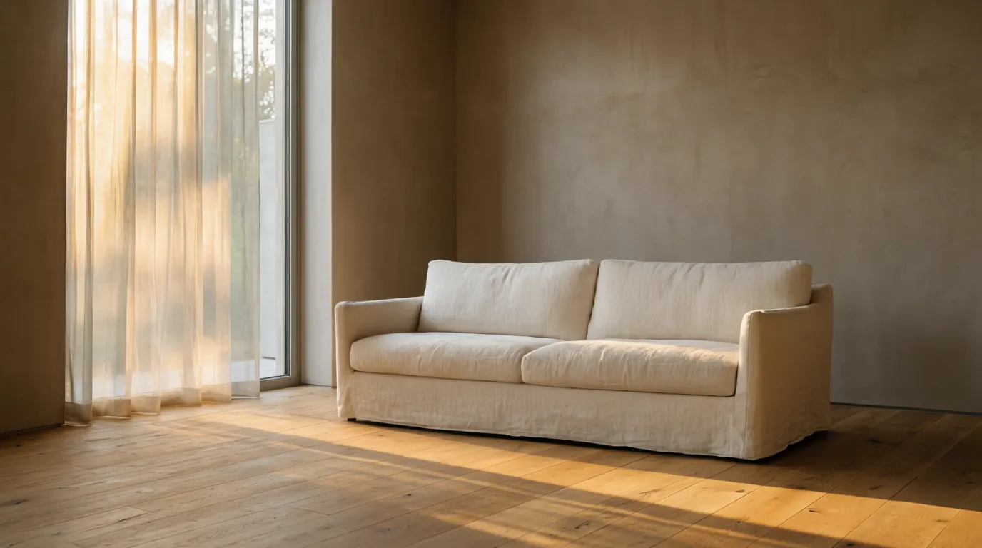
A consultation comes from three things: one photograph that stops the scroll, a services page that names who you work with and how the money works, and a form short enough to finish on a phone. Everything else on an interior design site is supporting material for those three.
What happens between a first visit and a booked consultation?
The visitor makes three decisions in sequence, and most interior design sites lose people at the second one.
Decision one is taste. Is this work for me. That is settled on the first screen, in a couple of seconds, on photography alone. Interior designers are usually excellent at this part, because the product is a photograph and they own good ones.
Decision two is fit. Do they work with people like me, on projects like mine, in my city, at something near my budget. This is where the drop happens. A site can be beautiful and answer nothing about fit, which leaves the visitor to guess, and a guessing visitor closes the tab or sends a vague message you will spend two emails qualifying.
Decision three is friction. How much effort is the next step. A blank textarea labelled tell me about your project is a lot of effort for a maybe.
A site that books consultations answers all three in that order, and never asks the visitor to reorder them.
Which photograph should the homepage open on?
Open on the room that is most like the work you want more of, not the one you are proudest of.
Those are different photographs more often than studios expect. The proudest image is usually the largest budget, the most unusual brief, or the one a magazine ran. The best opening image is the one that says: this is the kind of project I do, repeatedly, and I do it at this level.
Full width, no marketing sentence laid over the top. If a caption is needed, give the room, the city and the scope in six or seven words. The selection logic here is the same one I described for architecture practices in what makes an architecture website win awards: the set is judged as a set, and the weakest member sets the level.
How many projects should sit on the homepage?
Six to eight, as a working rule of thumb. Enough to show range, few enough that a visitor sees all of them before deciding. Beyond about a dozen thumbnails the grid stops being a portfolio and starts being a search problem.
The full archive can live on a projects page. The homepage is a curated first impression, not an inventory.
What belongs on the services page if I do not publish prices?
The shape of the engagement, the minimum you take on, and who the work suits. That is enough to filter without a price list.
Three things do most of the work:
The engagement types, in your own words. Full service, room by room, a paid consultation hour, procurement only. Name them plainly and say what each one includes and excludes.
A minimum. Something as simple as saying that full service projects usually start at a whole floor, or at a stated fee, removes the largest single source of unqualified enquiries. You do not have to publish a rate card to publish a floor.
A sentence about who it suits. Private homes in and around one city, hospitality clients, developers. Geography and client type are half of fit.
The same holds for any fee: a number on the page changes the mix of who writes to you, which is why what an architecture website costs in 2026 states the market bands openly. It rarely changes the total number of good enquiries.
How short should the enquiry form be?
Six fields. The version I ship on interior design sites is: name, email, location, project type as a select, a one line description of the space, and a timeline as a select. Phone is optional and marked optional.
Every extra field is another chance to abandon on a phone, one handed, on a sofa, at half past ten at night. The long brief belongs in the reply, not in the first contact. Once someone has typed their name and pressed send, they will happily answer eight follow-up questions by email.
Two details that matter more than they should. Put the form at the end of every project page, not only on a contact page, because the moment of highest intent is the bottom of a project the visitor liked. And do not put a CAPTCHA in front of it. A honeypot field and a server side check stop the bots without asking a paying client to identify traffic lights.
Where should the consultation actually be booked?
On the site, in a calendar, if you offer a fixed length discovery call. Otherwise use the form and state a reply window.
The mechanism matters less than the promise. A line saying that I reply within two working days does more for enquiry rates than any button styling, provided you keep it. If you cannot keep it in August, say three.
The same mechanics apply across trades with a site visit at the end of the funnel. I set out the builder version in the home builder website that books site visits; the difference for interior designers is that the first meeting is more often paid, and a paid first meeting deserves its own short page explaining what the client gets for the fee.
Does an assistant on the site help or get in the way?
It helps when it answers fit questions at the hour people actually browse, which is late evening, and hands over to the form.
The assistants I build are trained only on the studio's own site content: projects, services, about, press. They answer the ten questions that arrive every week anyway. Do you work outside the city. Do you take single rooms. What does the first consultation cost. Do you do the sourcing or do I.
The limits have to be honest. It cannot quote a fee for an unseen project. It should not guess a timeline. It must say when it does not know and offer the form instead of inventing an answer. An assistant that bluffs is worse than no assistant, because the bluff becomes an expectation you then have to walk back in person.
How fast does an image heavy site need to be?
Google's threshold for Largest Contentful Paint is 2.5 seconds on mobile, measured at the 75th percentile of real visits, which is documented on web.dev. Interior design sites are the heaviest sites in this trade, because the photography is the product, so this is the one technical number worth watching.
My working budget when I build: the first screen under roughly 300 KB total, hero photography served as WebP or AVIF at the size the device will actually display, everything below the fold lazy loaded, and no slider plugin dragging in three font files nobody chose.
That budget is not a compromise on image quality. A 2560 pixel wide hero in WebP at sensible quality is usually smaller than the 1.4 MB JPEG a theme uploads untouched, and it looks better on a retina screen.
What would I change first on an existing site?
In this order, and each one is a day of work or less:
- Replace the opening image with the best fit room, full width, no text over it.
- Add a fit paragraph near the top of the services page: who you work with, where, and the minimum project you take.
- Cut the enquiry form to six fields and repeat it at the end of every project page.
- State a reply window on the contact page and keep to it.
- Compress the hero, remove any slider, check the mobile result against the 2.5 second threshold.
- Ship the structured data. On the sites I build that means Organization, Person, BreadcrumbList and FAQPage JSON-LD, following the Google Search Central structured data documentation.
None of that is a redesign. If a site is already photographed well, most of the enquiry problem is fit and friction, and both are editable in an afternoon.
When the structure underneath is fighting you, that is a different job, and it is the one I do: hand built in Next.js, no theme, live in weeks rather than months, with Foundation sites at three to four weeks once the photography is in. The method in full is on my page about web design for interior designers.
Questions people ask
- How many projects should an interior design portfolio show?
- Six to eight on the homepage as a working rule, with the full archive on a projects page. The set is judged collectively, so a weaker project drags the whole impression down more than an extra strong one lifts it.
- Should I publish my fees as an interior designer?
- You do not need a rate card, but you do need a floor. Stating a minimum project size or a starting fee removes most unqualified enquiries without exposing your pricing model to competitors.
- How many fields should an enquiry form have?
- Six. Name, email, location, project type, a one line description and timeline. Keep phone optional. Ask for the detailed brief in your reply, once the person has already committed to contacting you.
- Does an AI assistant replace the contact form?
- No. It answers fit questions late at night and then hands the visitor to the form. Trained only on your own site content, it should say when it does not know rather than guess at fees or timelines.
- How fast should an interior design website load?
- Aim for Largest Contentful Paint under 2.5 seconds on mobile, Google's documented threshold. That is achievable with full bleed photography if the hero is served as WebP or AVIF and everything below the fold loads lazily.
Zaid Rais designs and builds websites, search and AI-answer visibility, and AI assistants for people with an eye for design, from Amsterdam. Read more on web design for interior designers, or book a consultation.